
Monitoring Type 2 Diabetes.
Type 2 Diabetes is a condition where the body produces less insulin than required.
Less insulin leads to hi blood glucose levels and When blood sugar levels are high, the body may struggle to effectively manage glucose. This can lead to various issues such as fatigue, increased thirst, frequent urination, blurred vision and over time, if not controlled it can lead to organ failure and life threatening complications.
It’s crucial to manage blood sugar levels through a healthy lifestyle and, if necessary, medical interventions.
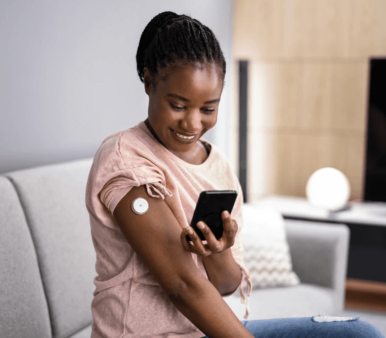
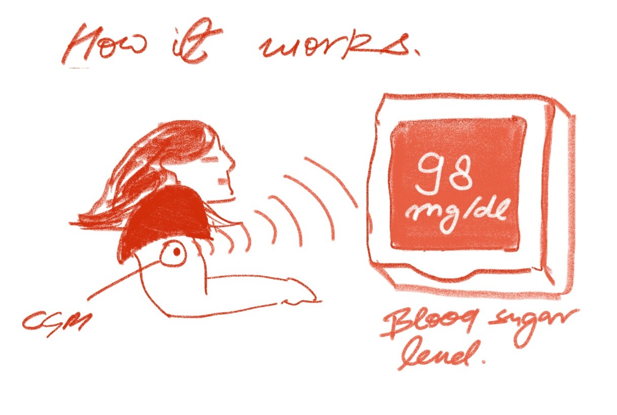
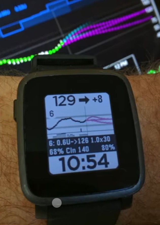
Current methods available to monitor blood sugar levels: CGM’s can track your live blood sugar level.
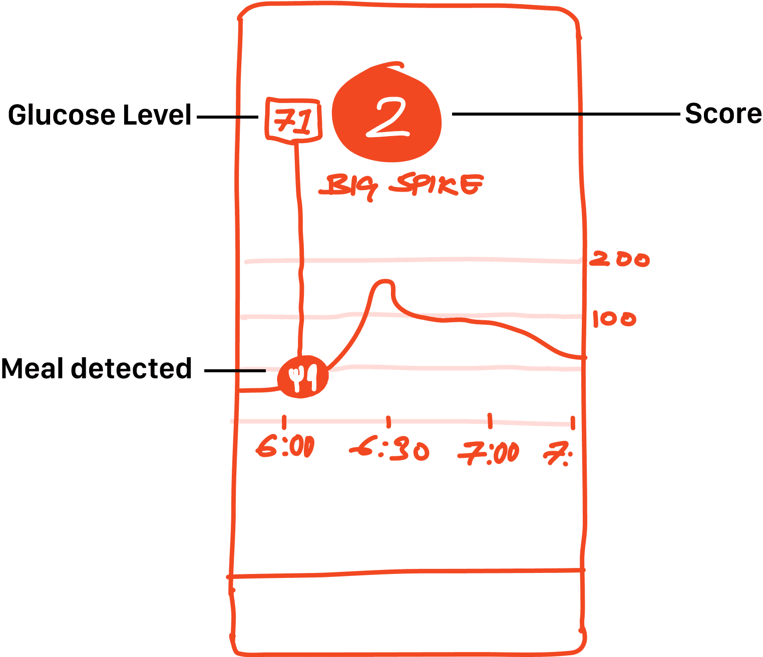
Everyone can have a glucose spike.
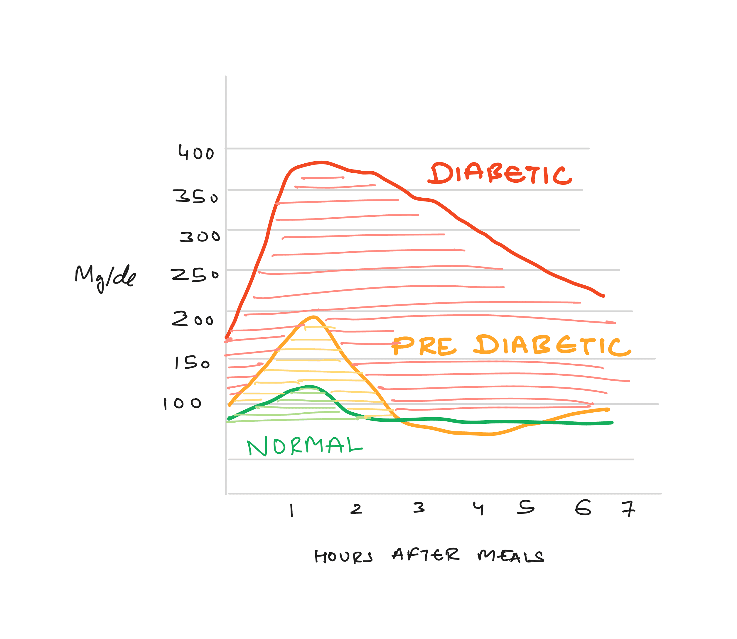
After having a meal, a normal person's Glucose Levels subside within 1-2 hours depending on the meal. For a Pre-Diabetic this takes more than 3 hours and for a Diabetic this can take more than 6 hours (No insulin or any other medication taken).
Existing Solutions :
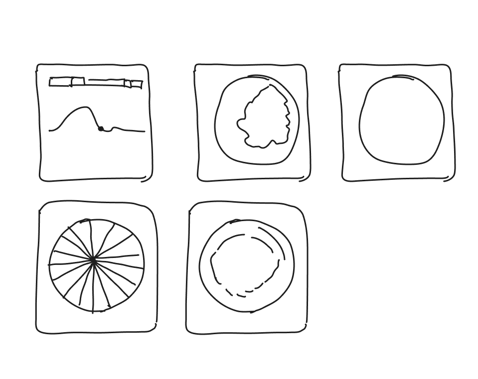
Current conceptual model:
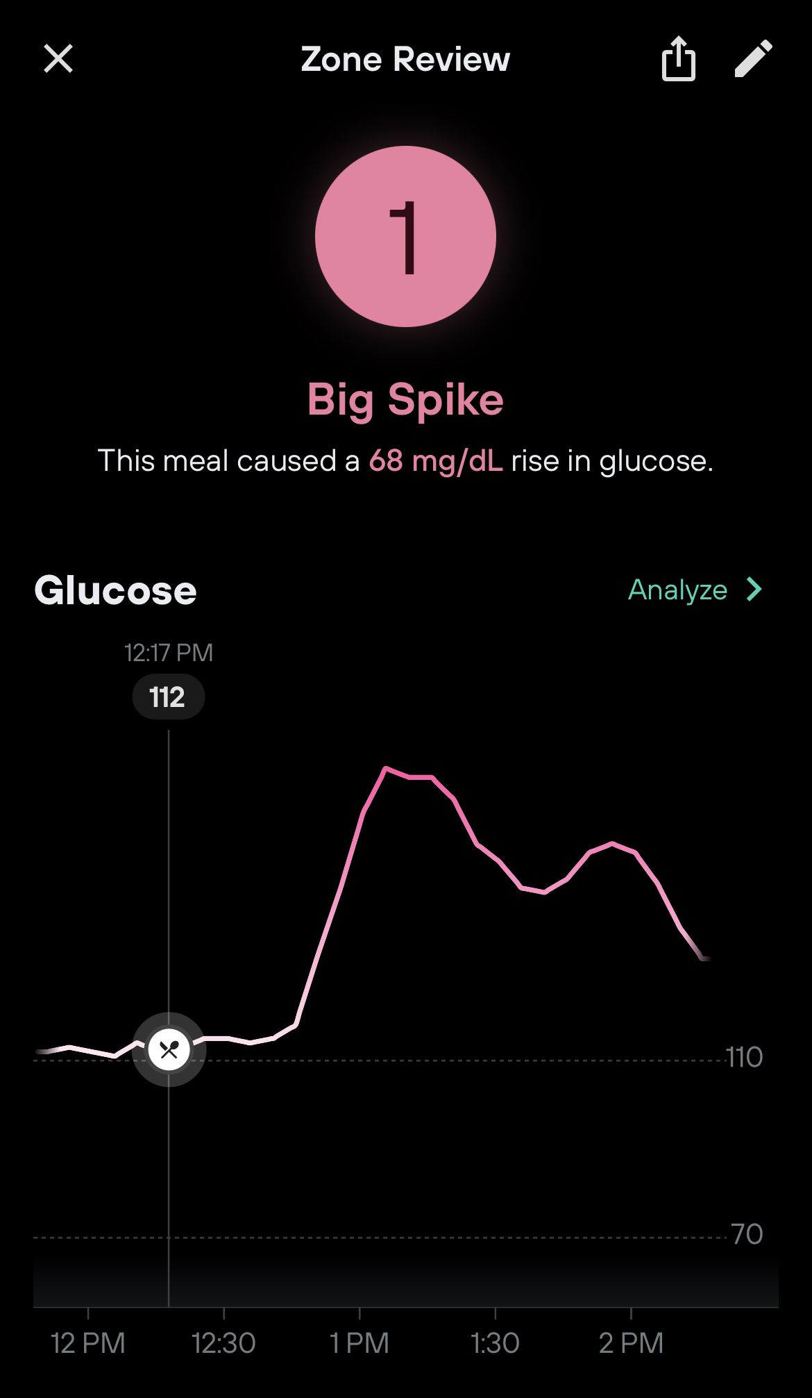
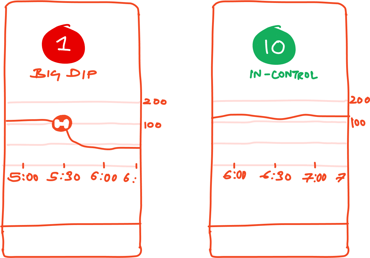
Plotting a graph of the glucose level vs time. Create a scoring system (1-10) based on the glucose spike, dip and control.
What the current design is good at :
- Solving for Non-Diabetics
- Casual non threatening tone.
- Focused toward meal planning and exercise.
What the current design is bad at:
- No mission-critical approach for life threatening situations (for Diabetics)
- Doesn’t caters to Pre-diabetics who can reverse their condition.
- The scoring system is arbitrary and non-scientific.
Tenets for the new model:
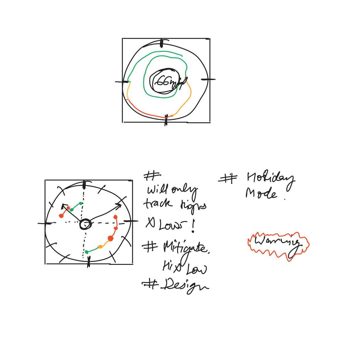
- Tired warning system to handle emergencies.
- Time in the zone” is the model that medical world adhere’s to.
- Timely interventions to mitigate things.
How the medics do it..
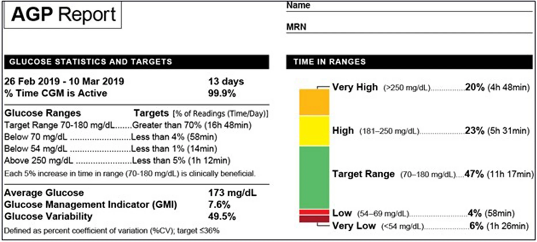
The approach is very logical and analytical but not very consumable.
All diabetics, specially in old age need round the clock protection. So moving from phone to watch seems safer.
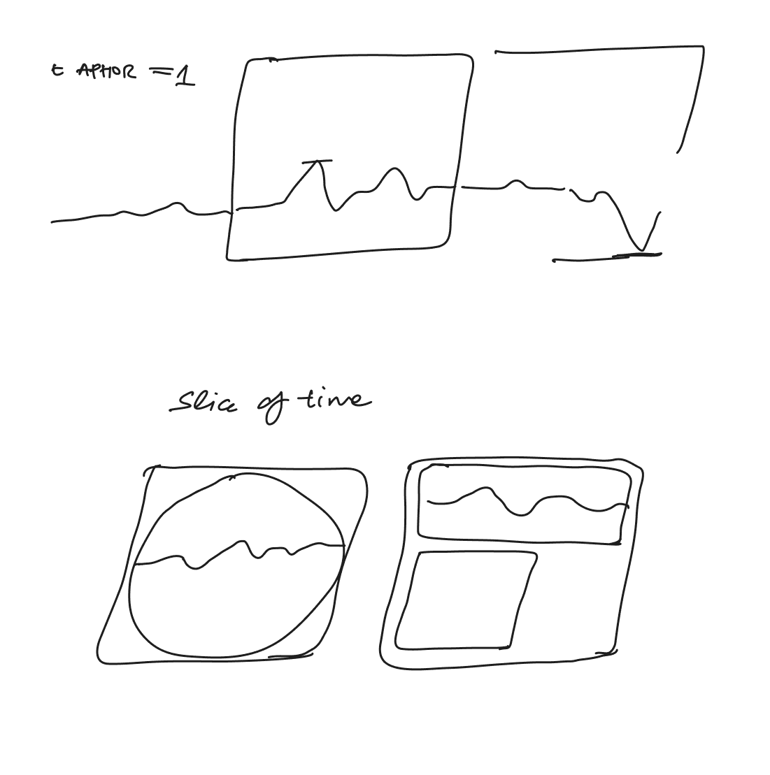
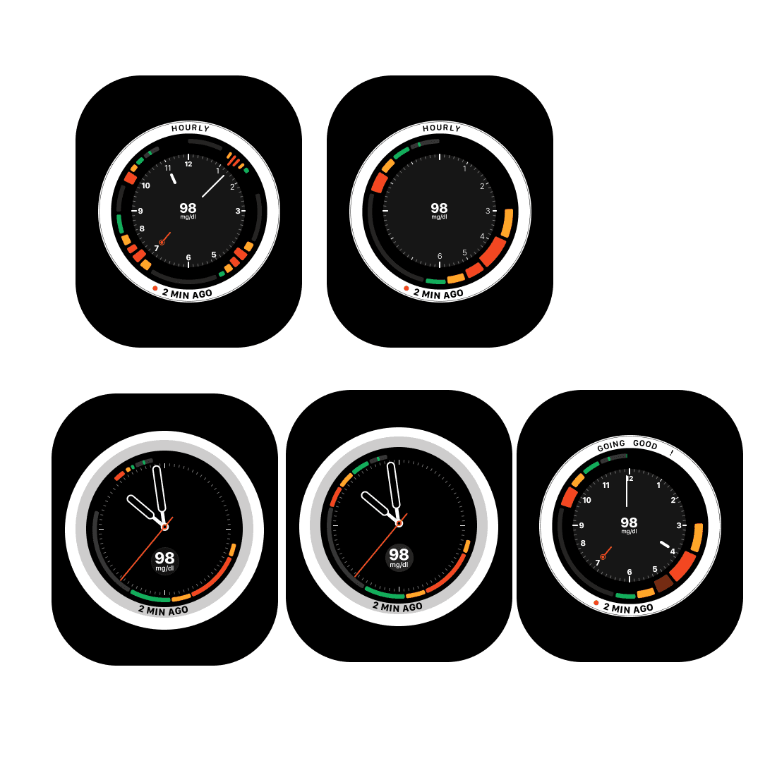
Some Scribbling…
Little more of it…
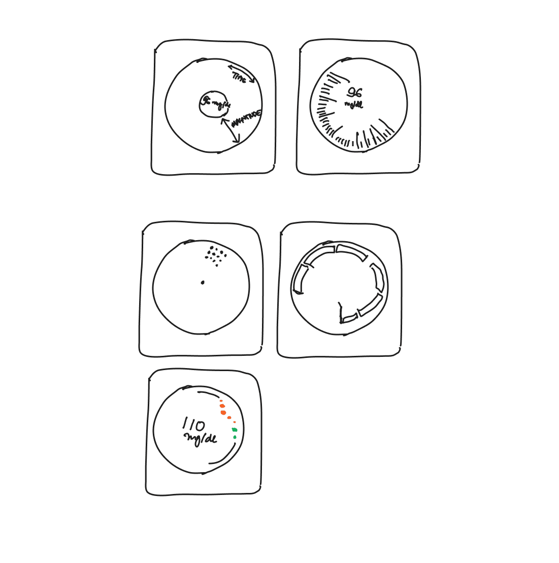
Are we there yet??
Things started looking less weirder.
Getting there..
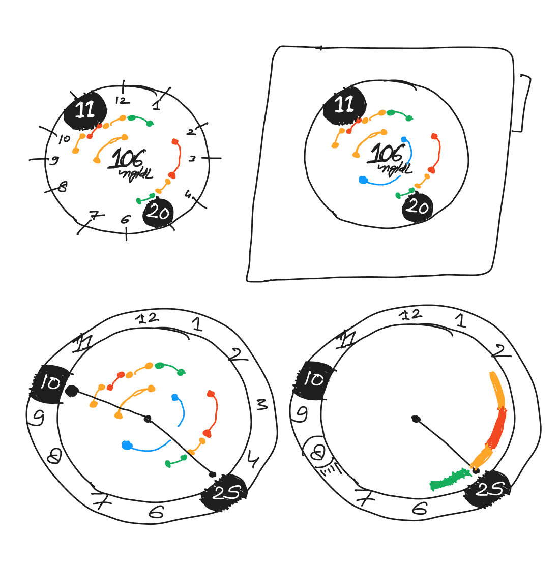
Plotting a graph along the circumference came out as a reoccurring theme. I wanted a way to show folks a way to scan how their day is going.
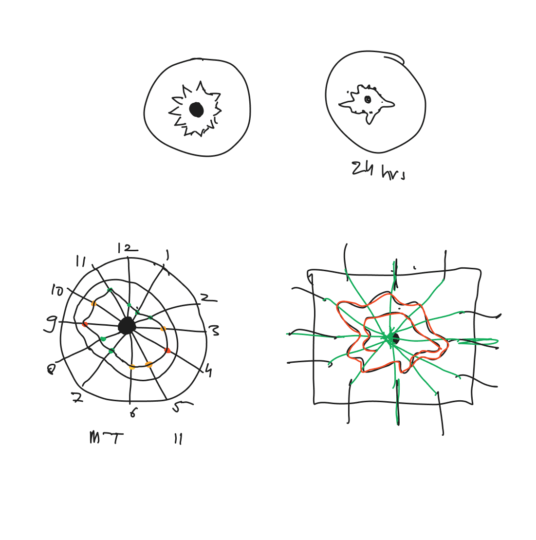
Further refining the above ideas.
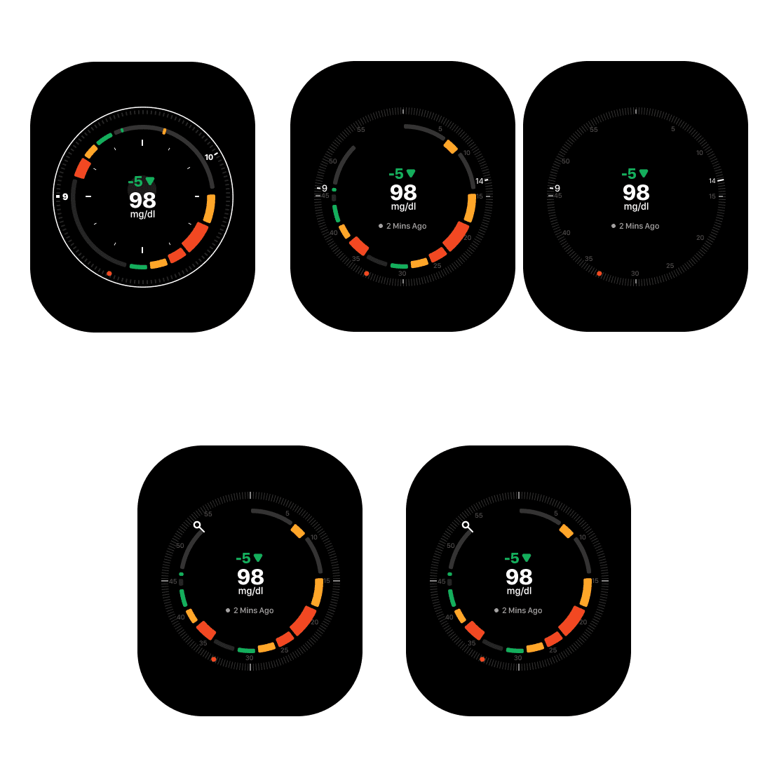
This is where everything started coming together..
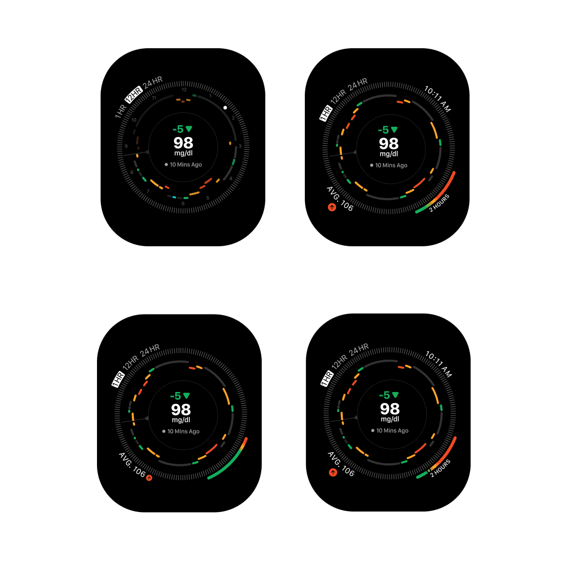
Now this is just a static design lets try and add some motion to it. Some initial attempts at the motion design.
A progress bar moving looked a bit odd, also needed a ticker/ watch hand to show a sense of Time:
Little more midnight oil.. Adding a needle mitigated a weird looking graph while also adding a sense of time.
Adding a watch hand and the graph moving in tandem makes things bit more organised or choreographed. Also wanted to see how would the graph look like when the data is being overwritten.
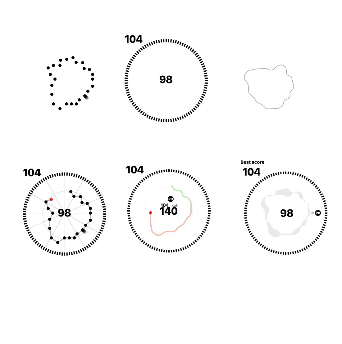
Since the basic functioning is in order now we can move on to the variations and plotting out different scenarios:
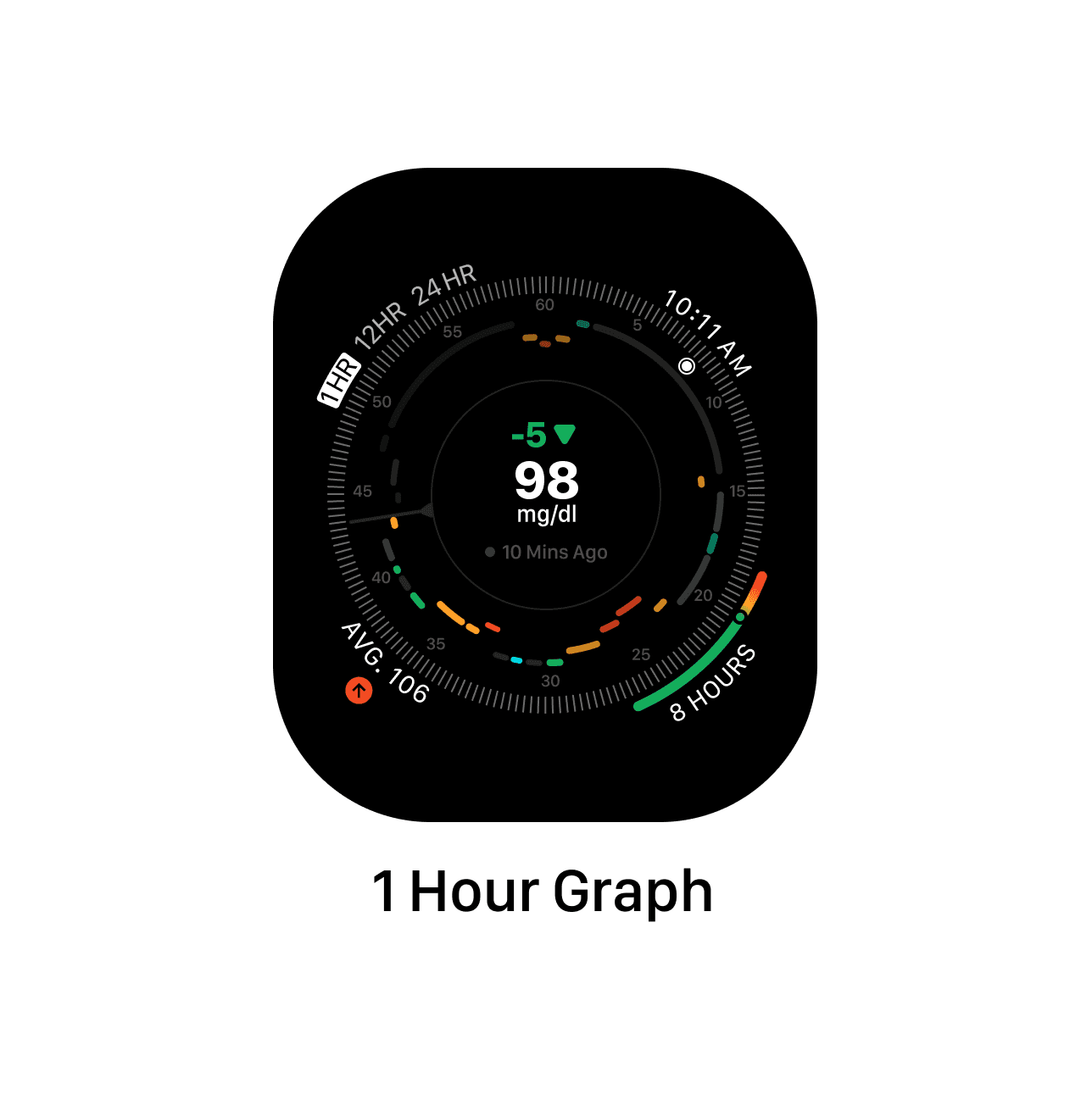
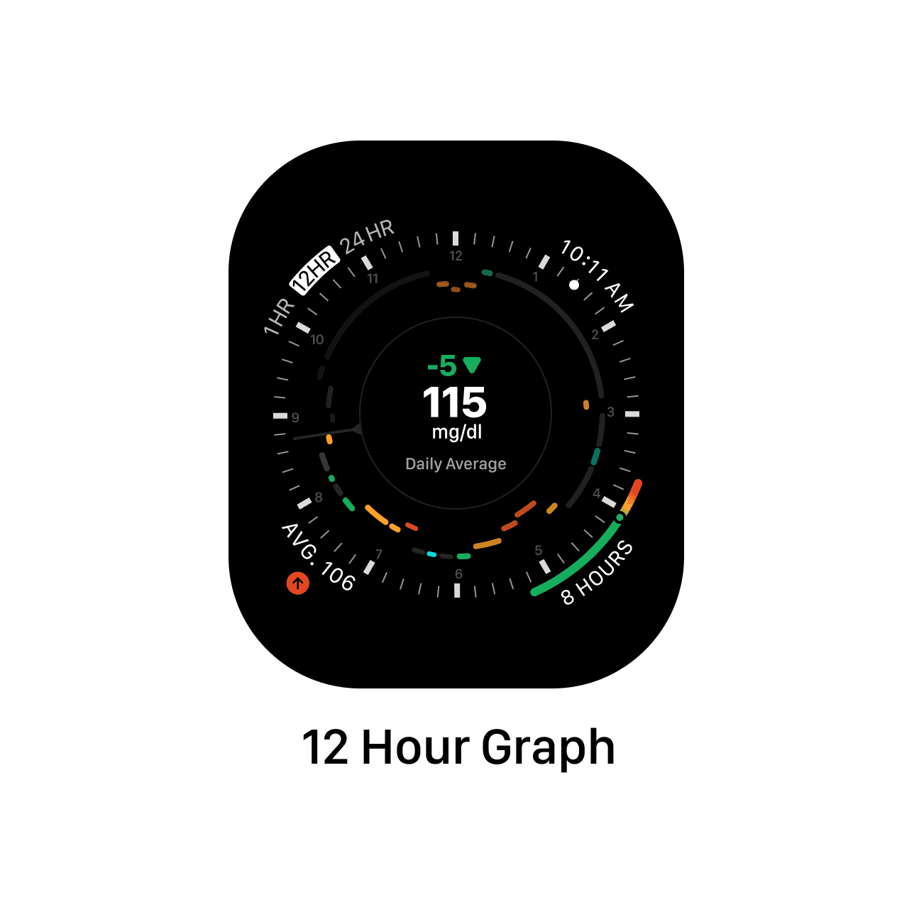
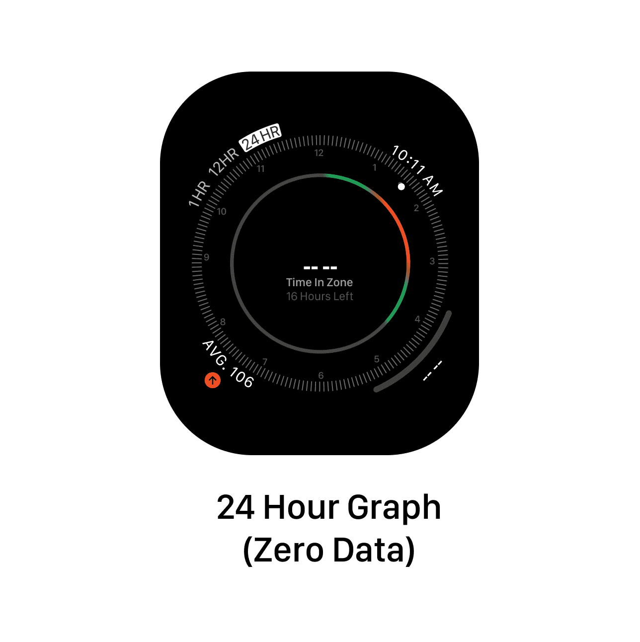
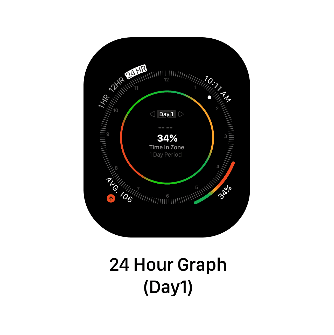
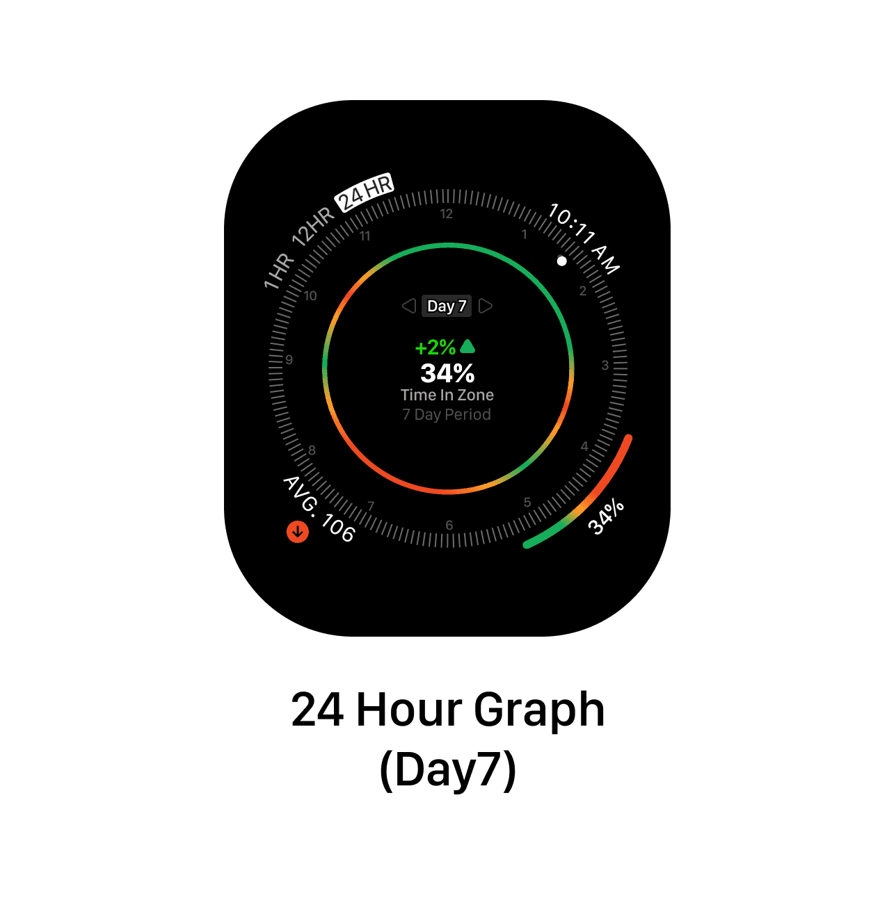
So we show the average Glucose levels and Time in the zone at bottom right corner. For the 24 hour period since we have more date we can show little more insights.
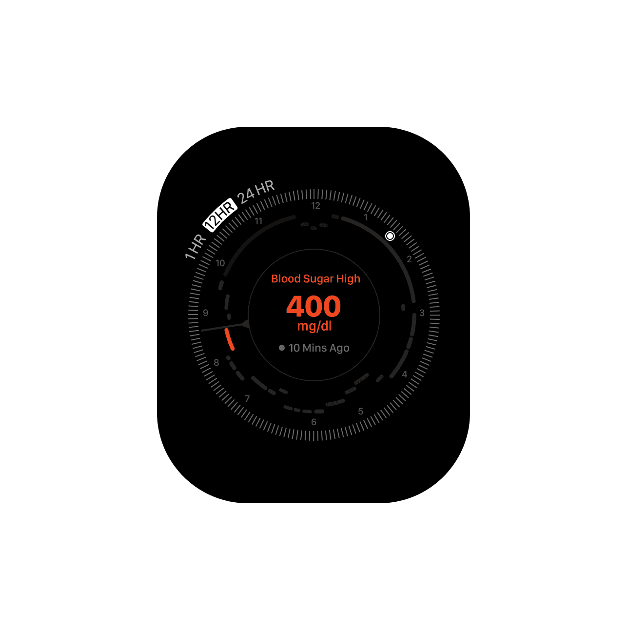
Now moving on handling the Interventions and critical messages. Bold changes in colour and motion design and pin point on the tone and message impact.
Continued…